


Thinking in Layers.
- Jack Taylor

- Sep 2, 2025
- 2 min read
Before using Risography you need to understand a little bit how it works. The Riso is often described as a ‘digital screen printer’ which is certainly an accurate description in that you print each colour as its own separate layer. This means that when you are creating a design to be printed you need to be considerate of what colours you are going to be printing in and make sure they are separated by colour on separate layers that can be printed individually.
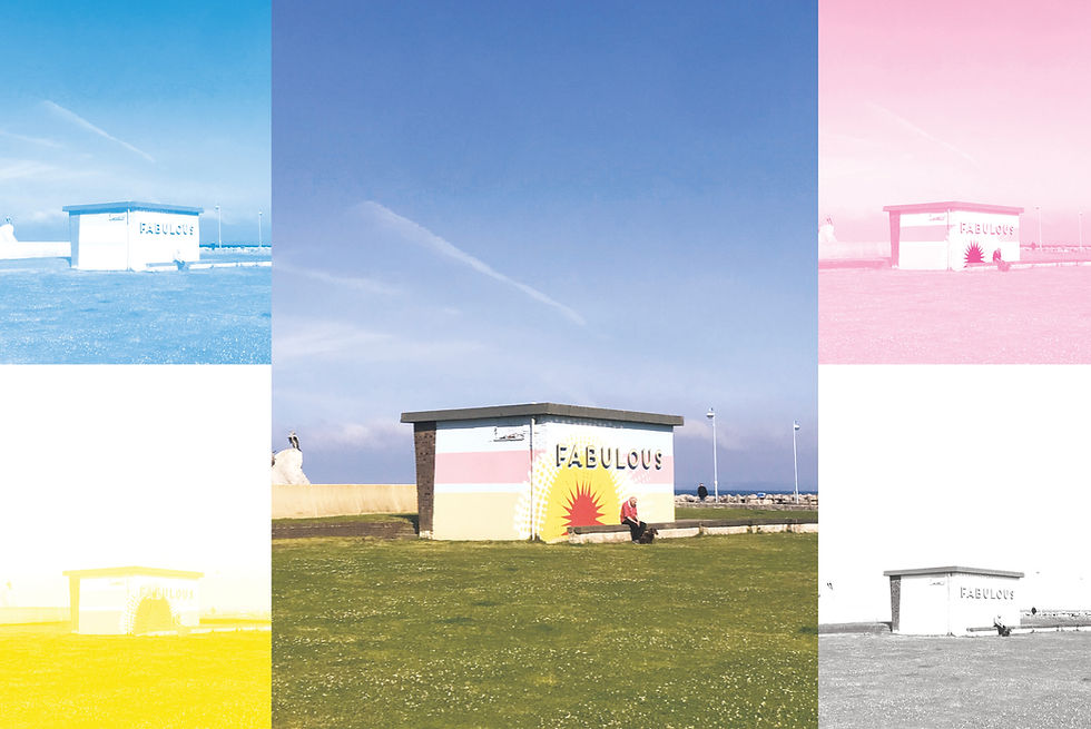
This means that with the Pink, Blue, Yellow and Black inks you can imitate CMYK printing but it is worth baring in mind that it will not be in the same high resolution you would expect from inkjet and lazer printers. Part of what makes Riso printing so unique and appealing is the ‘rough around the edges’ imperfections that come with riso printing and the more layers you print in, the more imperfections are likely to occur. Embracing imperfections is something you have to do with this printing method but it’s these same imperfections that make the Riso aesthetic so unique and helps give the work character.
Colour and Opacity.
What’s fun about Riso printing is that you often have access to ink colours other than CMYK. This means you can get lots of different colour options depending on which inks you choose for your layers. The Risos soy based inks are semi-transparent which means when they are layered on each other they produce the same colour no matter what order you print your layers and they combine beautifully to make lots of different colours!

The other thing to consider when creating your design to print is colour value. Colour Value refers to how light or dark a colour is. The way this translates in when using Risography is opacity. When printing a colour layer, the darker the colour the higher the opacity of ink will be printed. It’s easiest to consider this in terms of grayscale.

When an image is converted to grayscale you can see which areas are darkest despite what colour they are. The darkest areas will print at the highest opacity of whatever colour ink is in the Riso machine. In this case the 100% black areas will print at 100% pink so the darkest areas will be the most vivid. This means that the brightest colours in your design will not necessarily be the brightest colour printed. Rather the darker the colour, the higher the ink intensity will be applied to that part of the image. This combined with the layering of different colours can help you achieve a wide range of beautiful colours and effects. In Photography you can separate the colour channels to be printed separately and print in ‘CMYK’ and in Graphic Design you may have clear separate components that you can print in different layers. In illustration and creating artworks to be riso printed however, you must change the way you think about colour. Considering colour value over hue, as the hue is fixed by the inks you have available. This can lead to a new creative way of thinking however, and you can achieve fun results in your printing projects unique to risography!


Comments